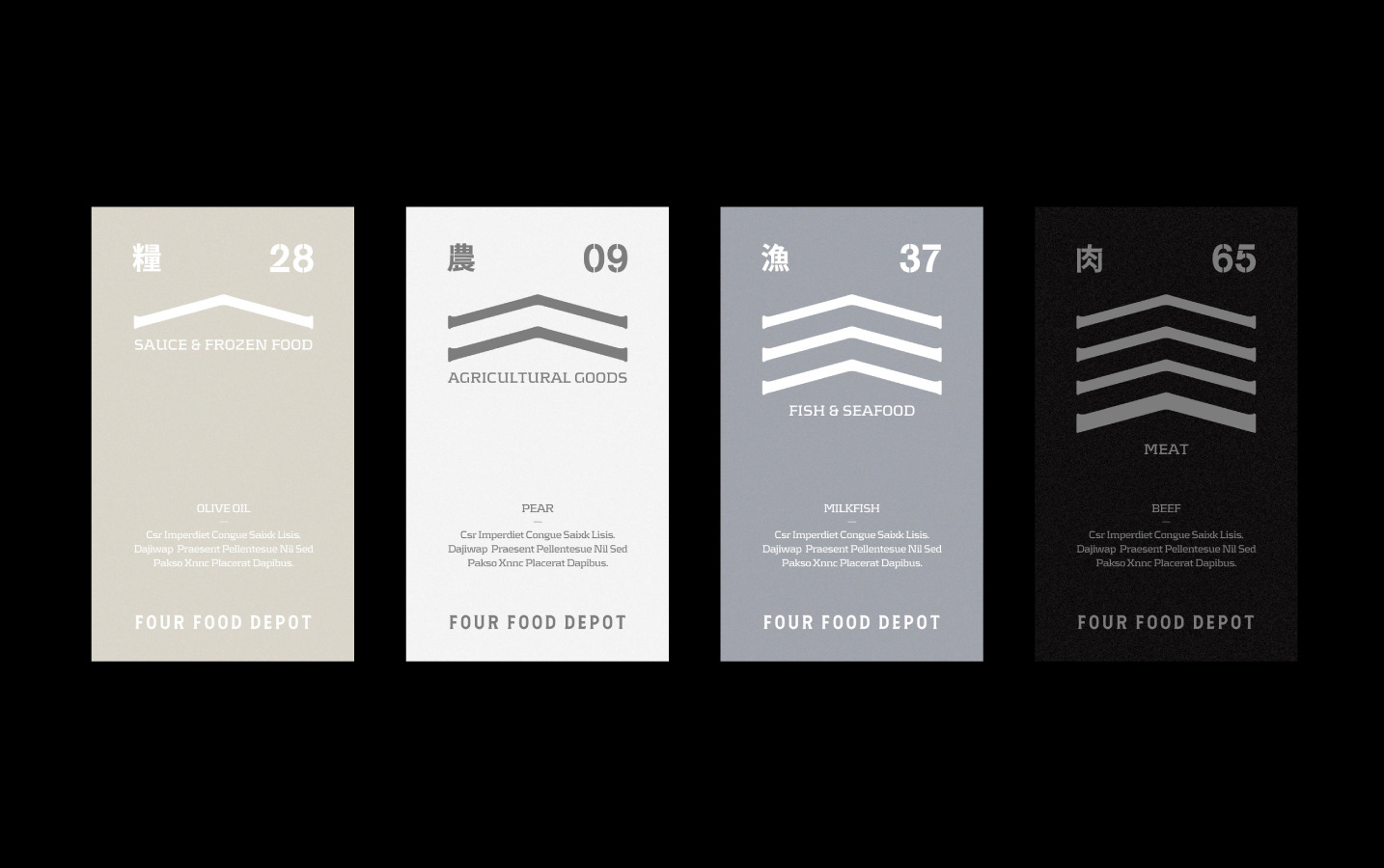
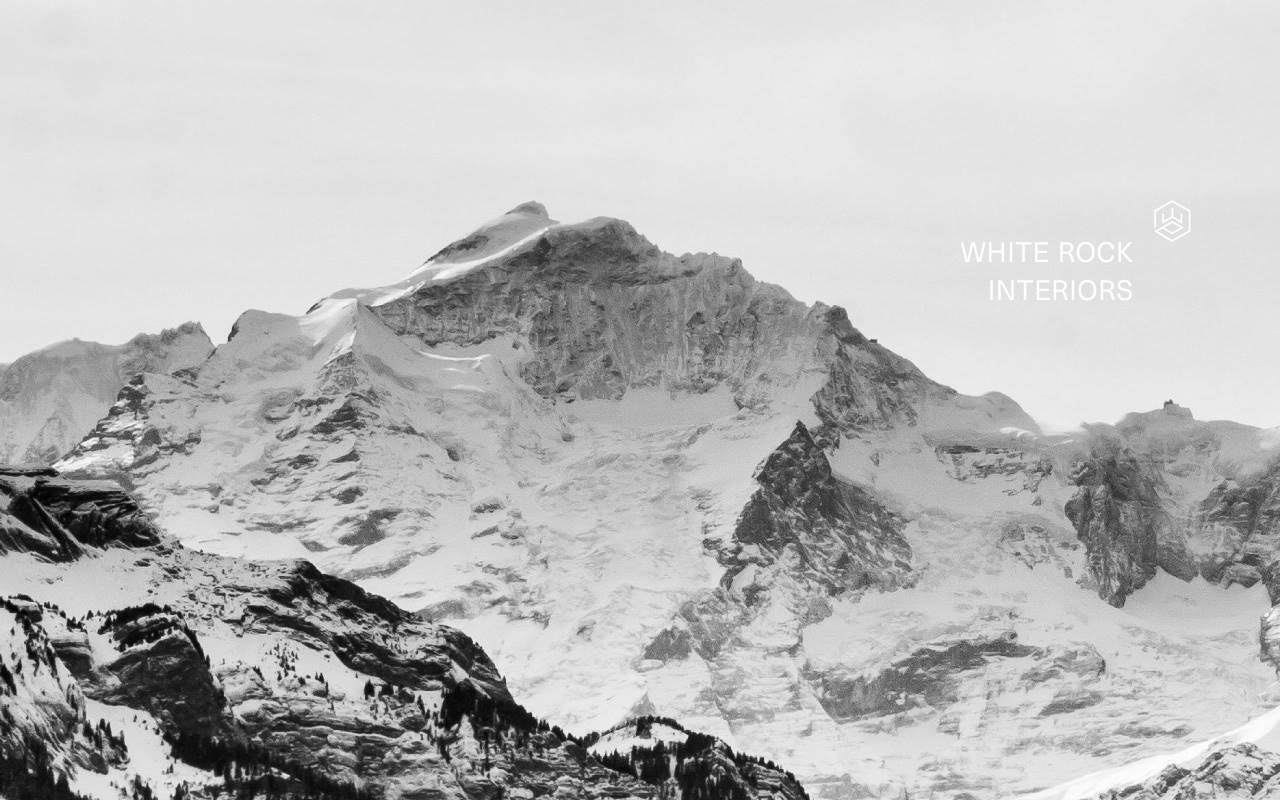
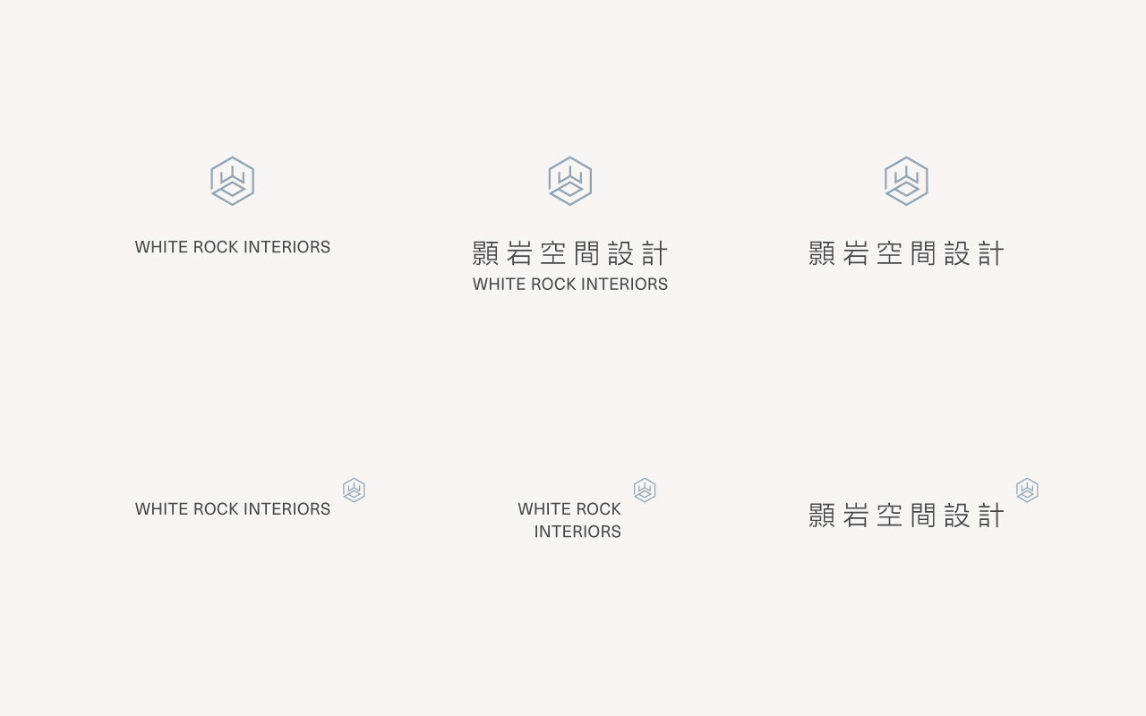
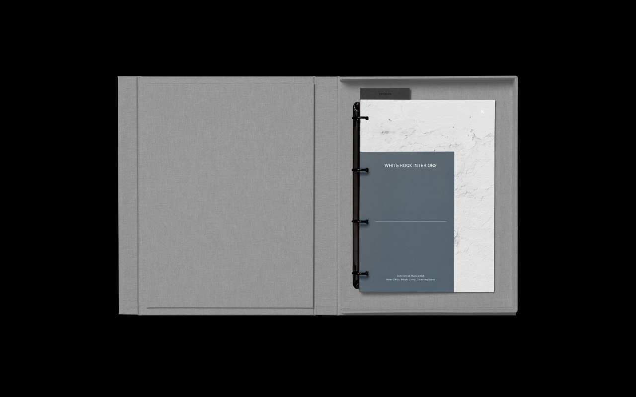
WHITE ROCK INTERIORS
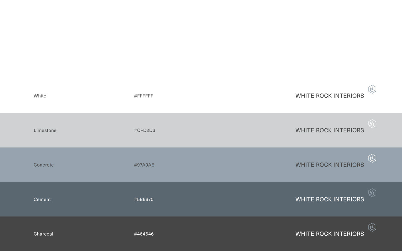
White — clear and fresh appearance / Rock — stony material
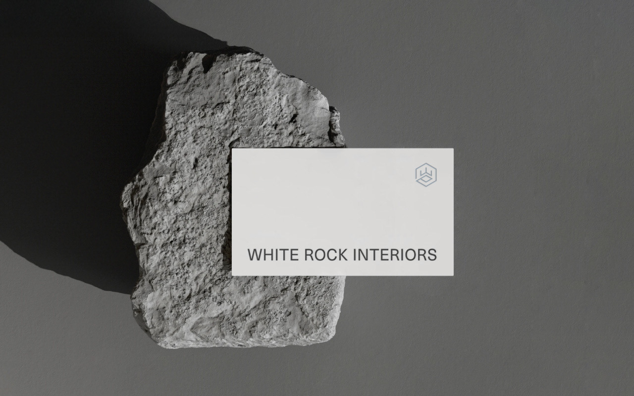
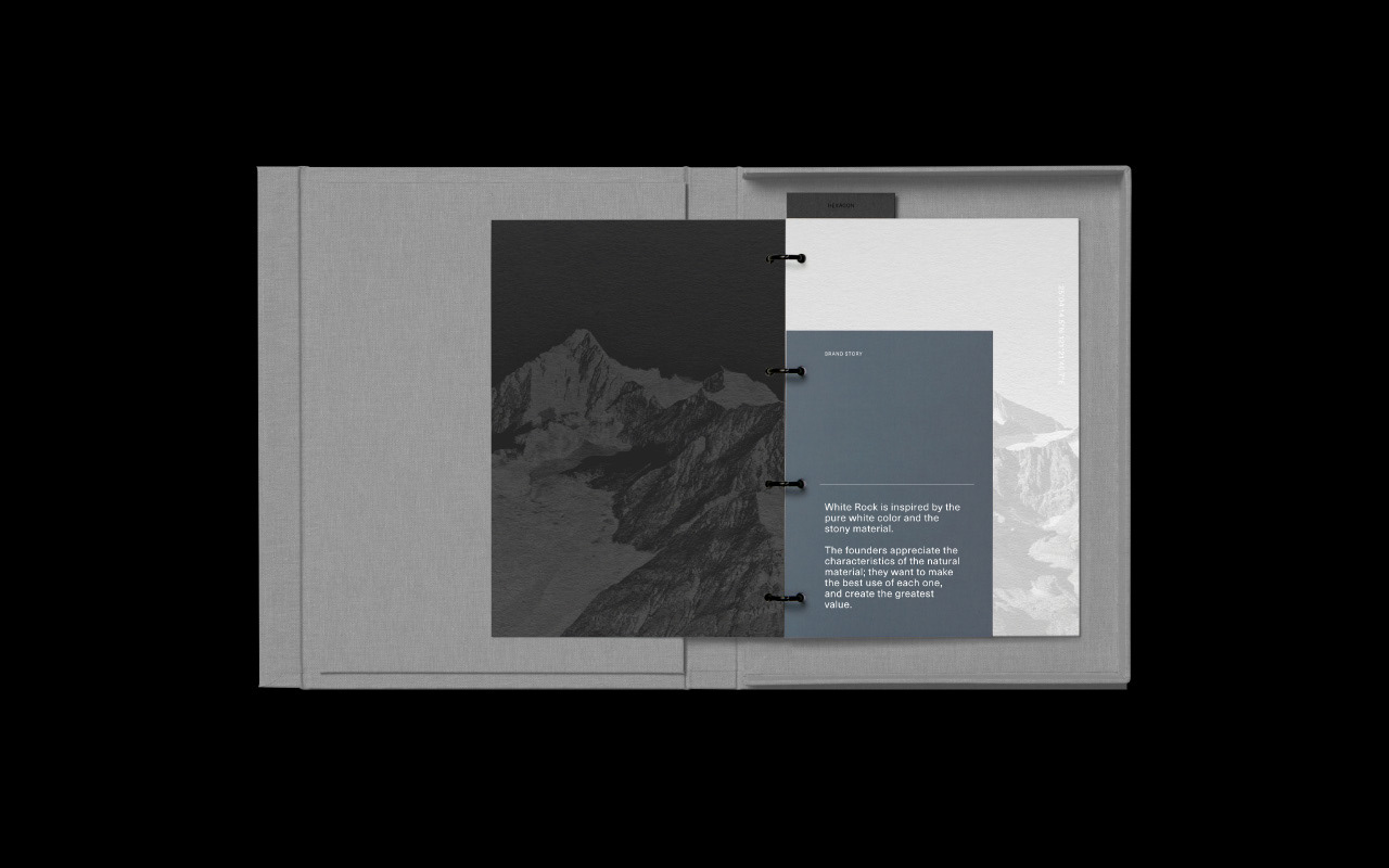
White Rock is inspired by the pure white color and the stony material. The founders appreciate the characteristics of the natural material; they want to make the best use of each one, and create the greatest value.
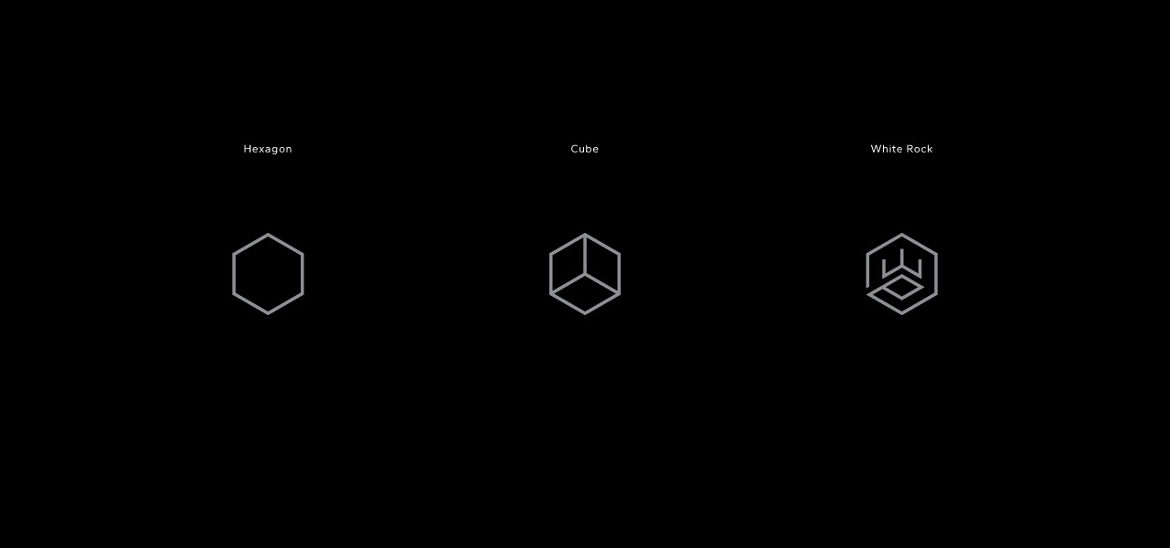
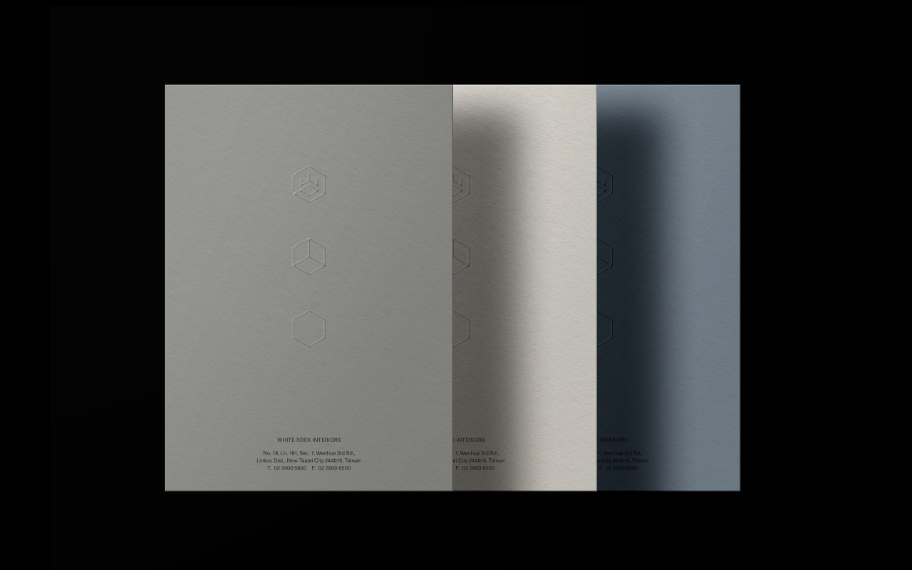
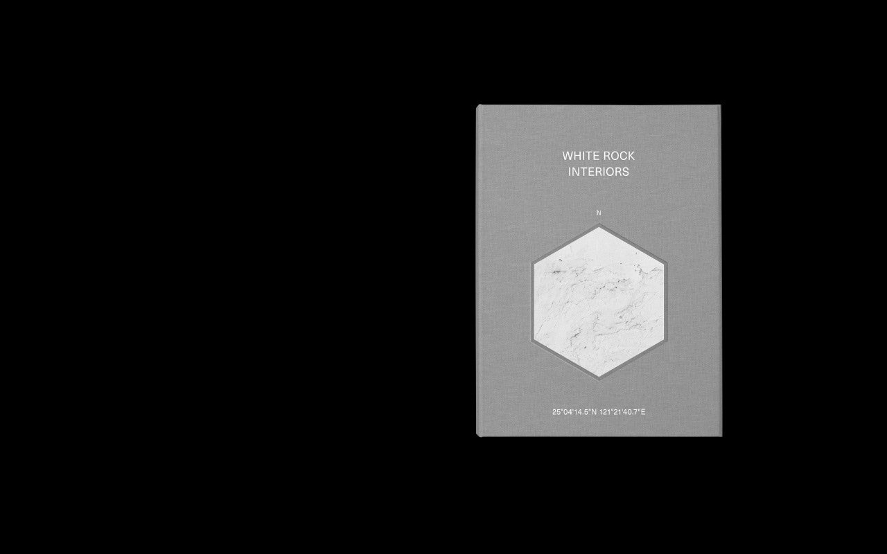
The new logo design is based on the Chinese character “rock” (岩), the initial idea came from the hexagonal shape of a rock combining a cube structure. From the top view, the strokes of the Chinese character created a 3D optical illusion within the hexagon outline to represent physical space. The opening in the hexagon outline acted as an entrance to allow more imagination and interaction. The new branding also conveyed the core value that the brand would like to spread, using different perspectives as observers to provide the most suitable suggestions for their clients.
顥岩空間設計
顥-清晰純淨的視覺感受;岩-堅實天然的材質特性。
White Rock 源於純粹的白色與岩石的天然材質。深信自然材料本身所蘊含的獨特價值,致力於充分運用其原始特性,以實現最大化的整體效益。
品牌標誌取自顥岩空間設計的「岩」字為視覺核心。以其結合六角形結構與立方體的空間概念。自俯視角度觀察,字形筆劃於六角形輪廓中構成三維視覺效果,象徵空間的層次與深度,外框所保留的開口,則如同入口,展現開放交流,引發更多想像空間。正是品牌想傳達的核心精神,透過多元視角進行觀察與思考,提供最適切且具專業深度的建議。
Client | White Rock Interiors
Services | Brand Identity, Brand Guideline & Editorial Design
AD&D | ZhouZhou Design
Services | Brand Identity, Brand Guideline & Editorial Design
AD&D | ZhouZhou Design